Venn Diagram Design System for Adobe Analytics
5-month | Multi-functional team of 5 | UX design & research
Data visualization is no longer just about functionality. They’re experiences that support discovery, communication, and decision-making for a wide range of people. And yet, implementing effective, inclusive, and delightful visualizations in web products is far from trivial, especially when accessibility, customization, and real-world use are at stake.
The new era of data visualizations and its design system
A critical gap in React Spectrum Charts:
React Spectrum Charts lacked native support for Venn diagrams.
Venn diagrams are especially valuable since they make overlaps, distinctions, and relationships between datasets immediately visible. Without this functionality, teams were forced to rely on third-party tools or static visuals, limiting both accessibility and storytelling potential. This gap reduced the effectiveness of React Spectrum Charts as a comprehensive toolkit for data-driven decision-making.
The goal is to design a Venn Diagram component & design system that
Helps users clearly understand overlaps, differences, and unique data points
Supports interactive data exploration
Fits seamlessly into the Spectrum 2 design system
The Designers Who 🫤
Need a flexible, scalable design system for creating visually compelling Venn diagrams.
Require easy design customization to align with diverse product needs and brand guidelines.
The Engineers Who 😵💫
Struggle to find well-structured documentation of the charting library and gain access to open-source code, enabling them to implement Venn Diagrams more efficiently without starting from scratch.
And last but not least,
The Data Analysts Who 🫨
Designers often rely on platforms like RawGraphs to generate accurate data visualizations, but customizing these visuals requires switching between multiple tools, such as Figma and Illustrator. This fragmented workflow slows down the process, creates friction, and reduces overall efficiency.
Need consistent visual clarity and accuracy within data visualization to effectively present data, support decision-making, and communicate insights to a wide range of stakeholders.
So what are the key insights?
🧩 Fragmented Design Workflow
🫥 Lack of Tools for Engaging Data Storytelling
Without a cohesive design system, data analysts and marketers struggle to present insights in a compelling visual format. As a result, they resort to long blocks of explanatory text or manually assemble charts using slide tools—both of which hinder clarity and impact in data storytelling.
Accessibility isn’t taken into consideration
Existing Venn diagram tools are not enough…
Customization isn’t serving storytelling well
There's a lack of tools that allow users to customize Venn diagrams, such as highlighting data insights to support data narratives.
How might we create a Venn diagram design system for analysts, engineers, and designers so that they can have better data visualization tools with consistent visual quality for data exploration, presentations, decision-making, and data representation?
No current Venn diagram tool’s color palette accommodates the highest value of color contrast or supports keyboard control, making it not inclusive to all users.
* I will talk about why defining the use of color for this Venn diagram design system was a big challenge.
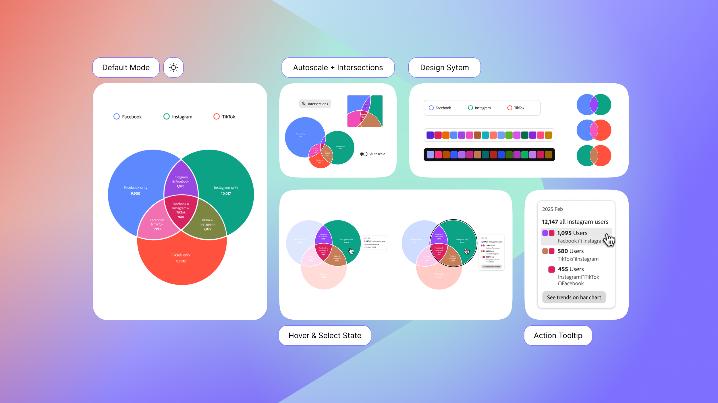
Snapshots of the design decisions I made ⬇️
Through user research, I identified several types of information users wanted to display in a customizable tooltip, including the total number of users, the proportion of each category within the total, and deeper insights comparing categories to larger groups.
To validate the design, I conducted usability testing with 9 participants (analysts, designers, and engineers) using different layout variations to understand:
Which information do users prioritize when exploring and presenting data?
How can the layout help users interpret data quickly and accurately while reducing cognitive load?
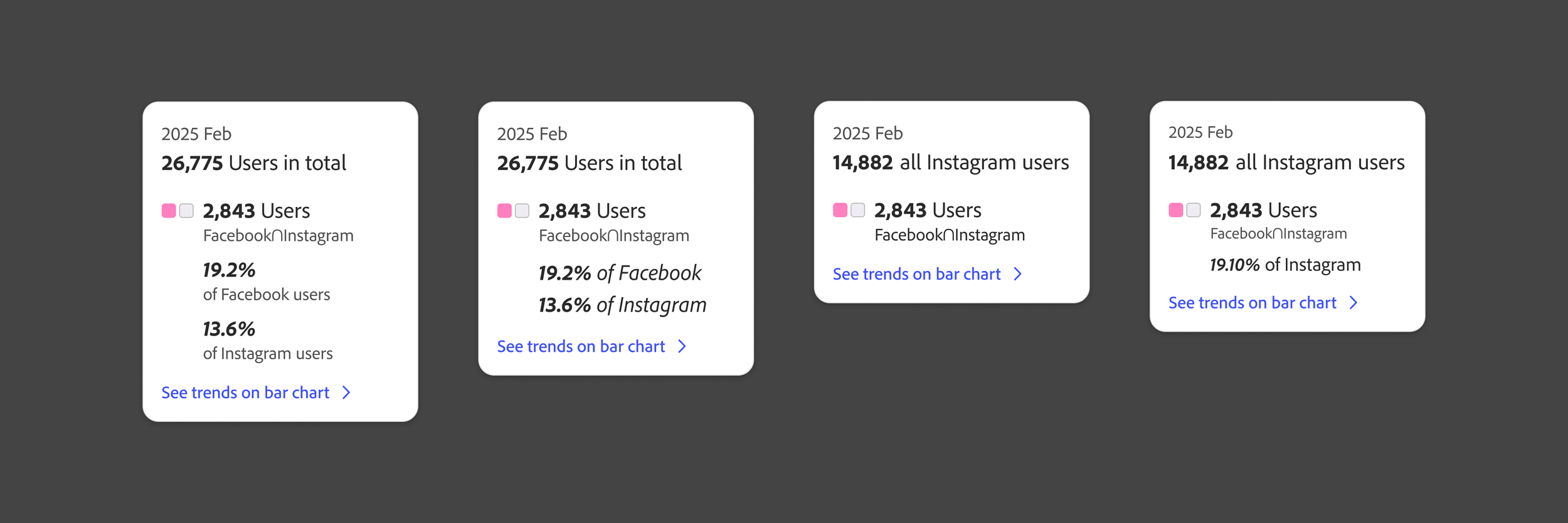
🔎 Info hierarchy & density, and HOW should we present it?
Iterations of test layouts for different information hierarchy and density I tested with users.
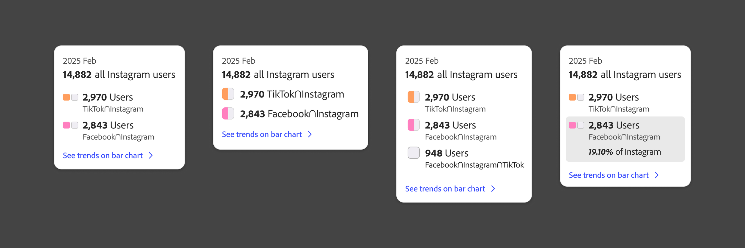
💡 Pivot in the interaction pattern with technical constraints
Initially, I envisioned a Venn diagram that allowed users to interact with each individual section to explore detailed data insights. However, we encountered a technical limitation in the current Venn diagram library, which only supports interactions with full circles or intersections of two or three (not every individual section).
Given this constraint, I reconsidered how users could still access the necessary insights despite the limited interactive areas.
I led the redesign and iteration of the interaction pattern to better support data exploration within these technical limitations.
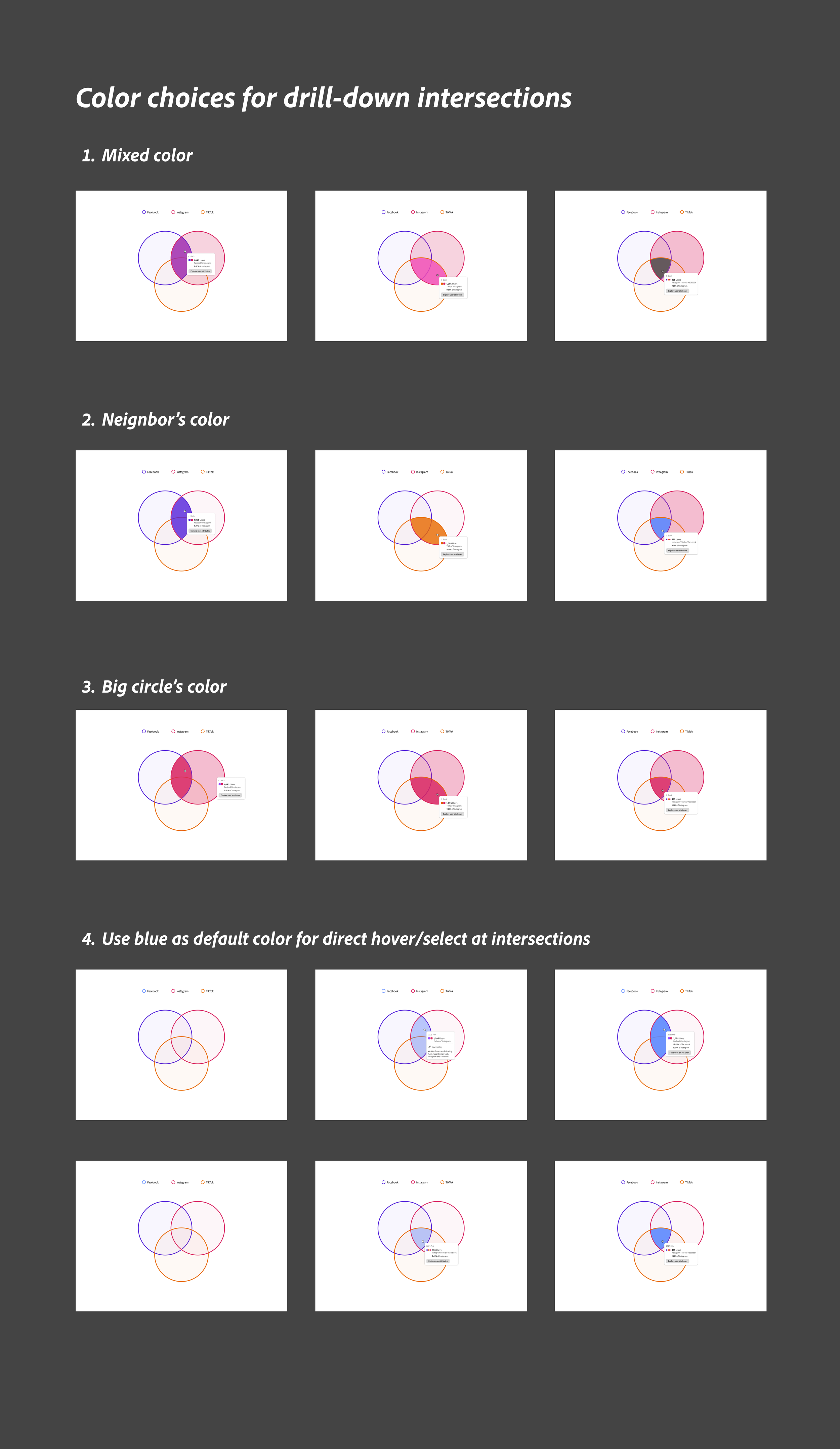
Iterations of different interaction patterns of the drill-down intersections
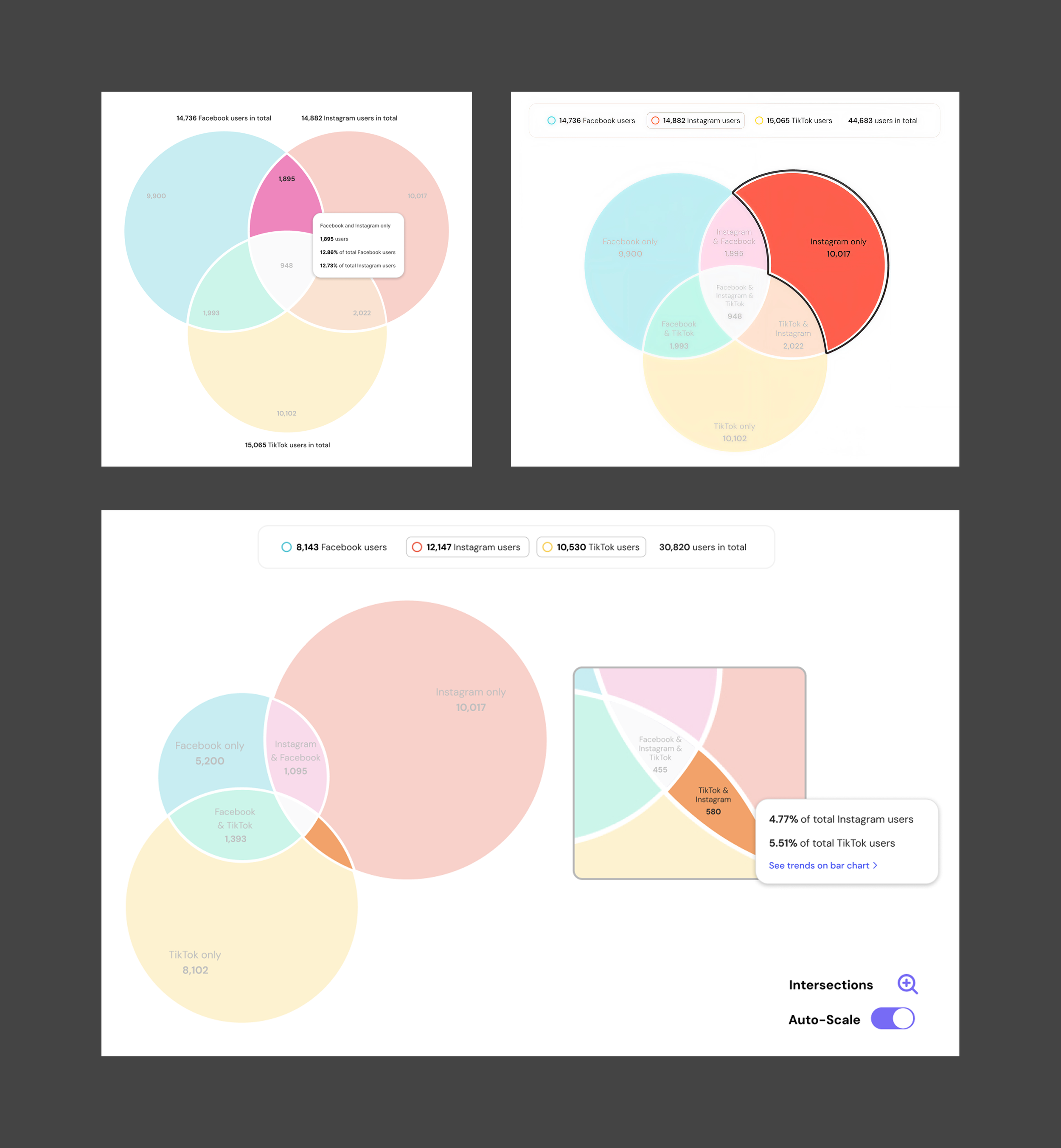
⏱️ Rapid iterations and testing with an ongoing design system
I worked within an evolving design system, Adobe’s Spectrum 2. When I received an update on the color palette mid-project, I quickly adapted the interface and reassessed accessibility with the new colors.
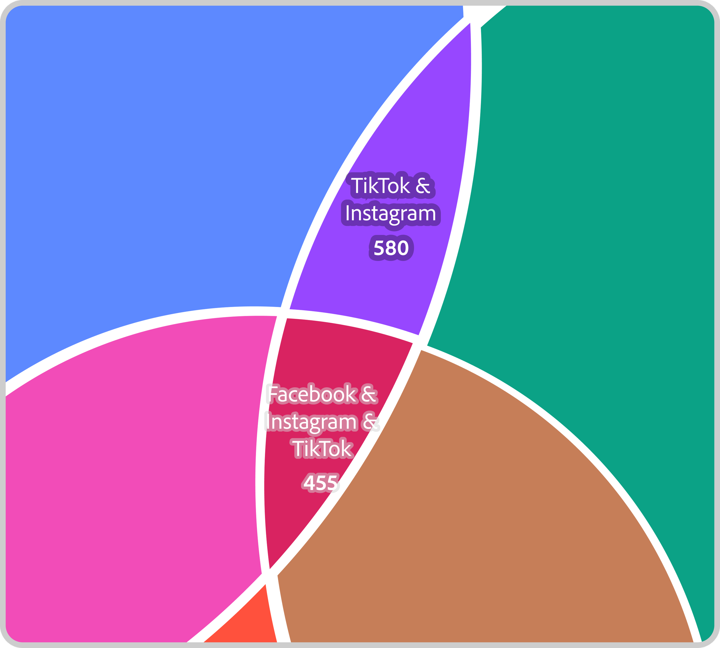
Within one week, I iterated on the design and tested new color options with users. I moved from a color-theory–inspired palette that emphasized overlaps to a categorical color scheme that more clearly distinguished each segment of the Venn diagram.
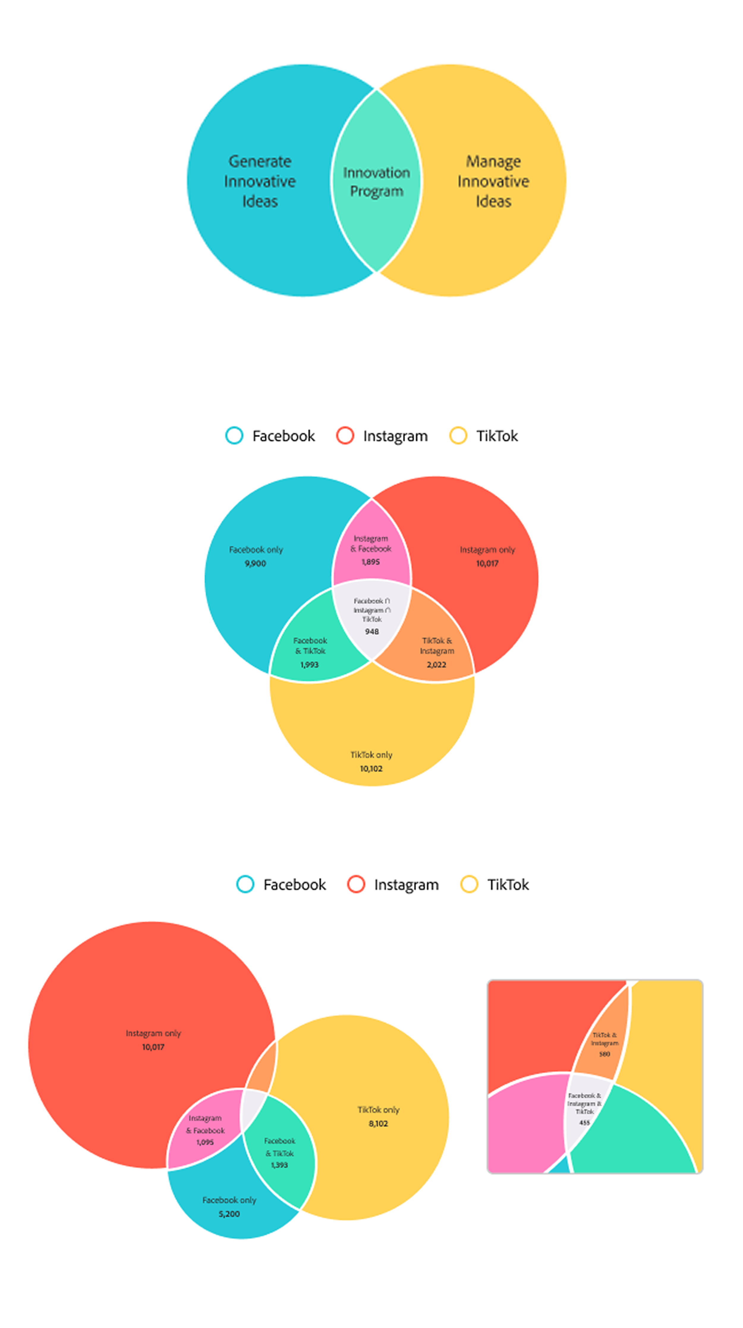
The original color-theory–inspired palette received positive feedback from users and design leadership, but I shifted to a categorical palette to align with the updated color system and better distinguish each segment.
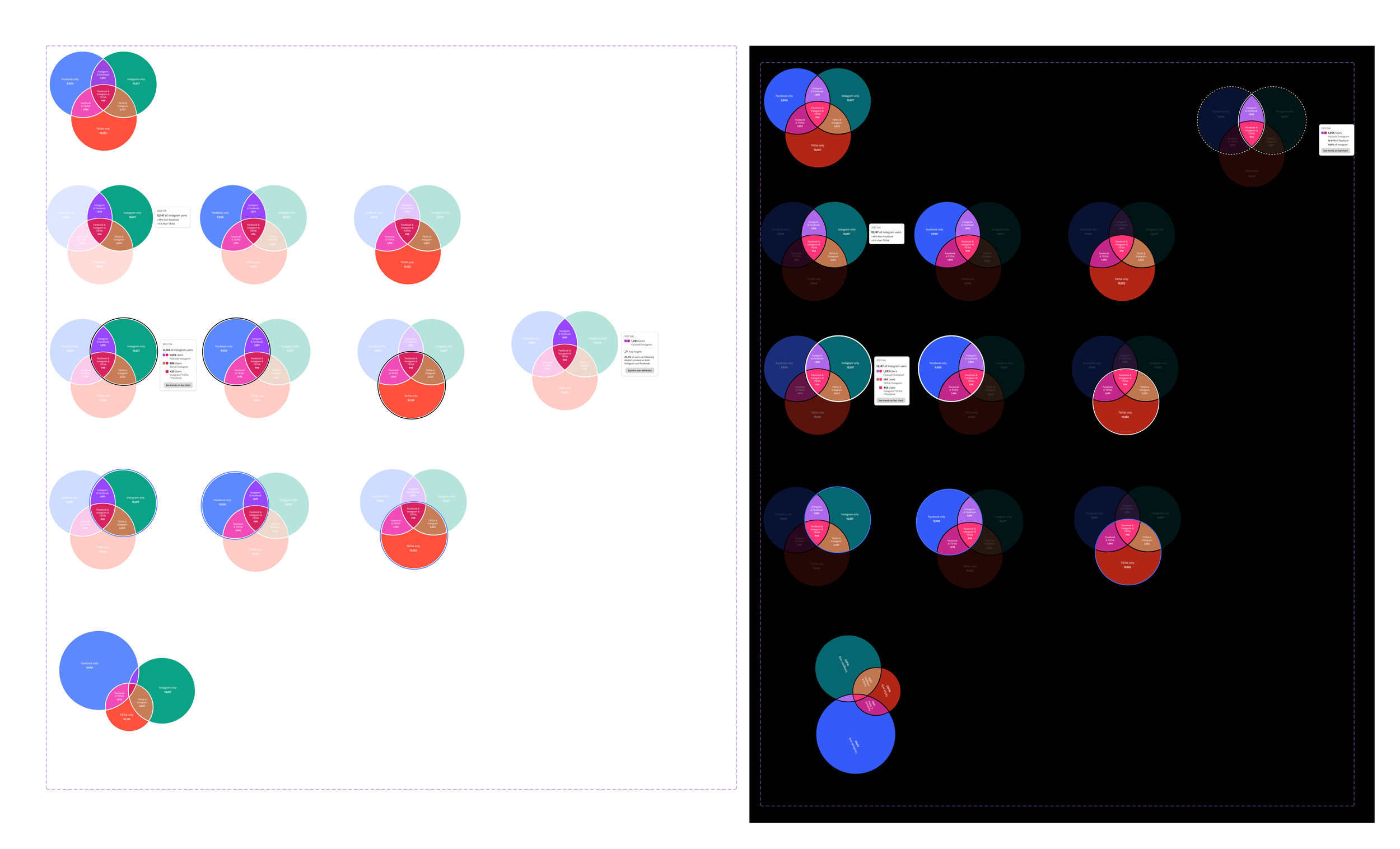
Prototypes for testing color choices in both light and dark mode
Tested text–background contrast by iterating on outlines and shadow treatments.